A custom golf marker should do more than mark a putt. The best ones carry identity, signal standards, and leave a lasting impression long after the round ends. If you are figuring out how to design custom golf markers, start with that principle first. A strong marker is not random decoration. It is a compact piece of recognition, connection, or personal story built with intent.
That mindset changes the design process. Instead of asking, “What can I fit on a small circle?” ask, “What should this piece stand for?” The answer will shape every decision that follows, from layout and iconography to engraving clarity and back-side function.
How to design custom golf markers with purpose
The first design choice is not color, font, or logo placement. It is use case. A marker built for a corporate event should not be designed the same way as one made to honor a unit, recognize a leader, or serve as a professional networking tool.
For personal use, the design often centers on identity. That might mean a branch connection, a profession, a meaningful emblem, or a visual language that reflects the owner’s standards and story. For tournaments and organizations, the marker usually needs to balance individual pride with broader brand representation. It has to feel elevated enough to keep, not just receive.
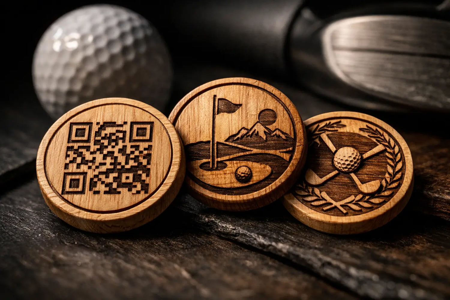
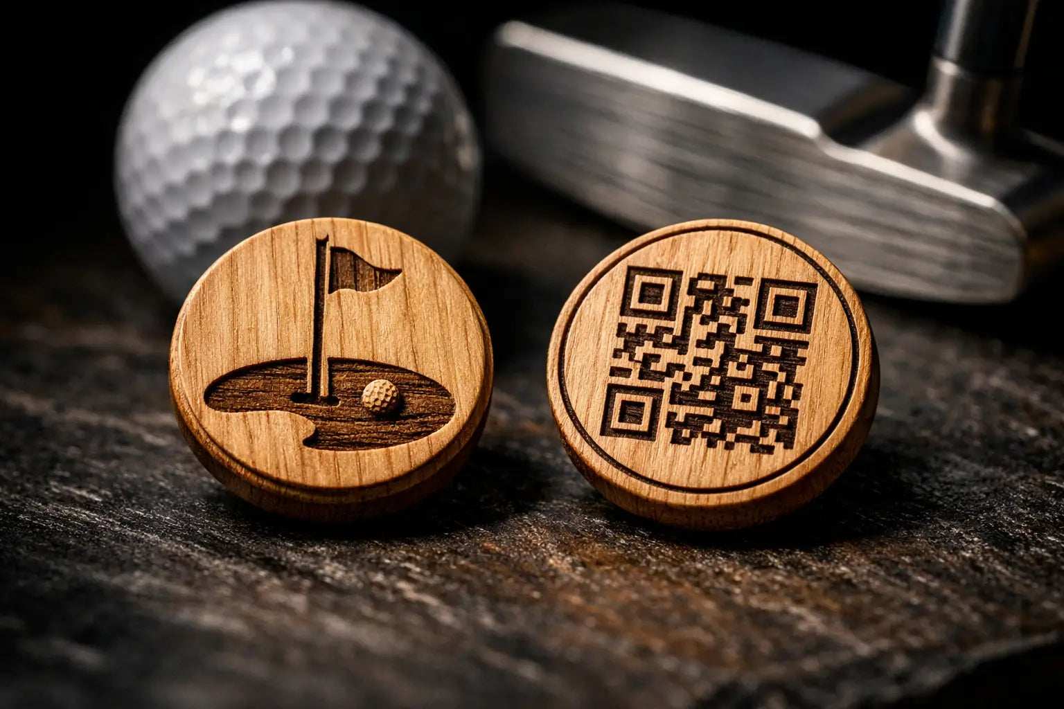
For networking, the design has another job. It must create a clean front-facing impression while supporting a practical digital function on the back. That is where many people miscalculate. They either over-design the face or treat the back as an afterthought. If the marker includes a QR code, both sides need to work together. The front earns attention. The back turns that moment into connection.
Once the purpose is clear, the design becomes more disciplined. You stop trying to say everything at once.
Start with one central idea
The strongest custom markers usually revolve around one dominant concept. That could be a company insignia, event identity, rank or service reference, a professional brand mark, or a challenge coin-inspired tribute layout. The mistake is trying to cram multiple messages into a limited surface.
A golf marker is small by design. That limitation is not a weakness. It forces clarity. One strong emblem with supporting details will always outperform a crowded design with competing elements.
If you are building for an organization, decide what deserves primary placement. In most cases, that is the main crest, logo, or symbolic centerpiece. Supporting details like event date, chapter name, unit designation, or motto should reinforce the centerpiece, not fight it for attention.
If you are designing for personal networking, keep the front disciplined and memorable. A clean identity mark, name treatment, or professional insignia often carries more authority than a face packed with extra graphics. Restraint reads premium.
Design for engraving, not just for the screen
This is where good concepts can break down. Artwork that looks sharp on a computer does not always translate well onto a precision-engraved hardwood marker. Fine details, weak contrast, and cluttered spacing can reduce readability once scaled down.
The best custom golf marker designs account for the production method from the beginning. Clean line work matters. So does spacing between visual elements. Small text can work, but only if it is intentionally placed and not asked to do too much.
Sharp engraving depends on discipline in the art itself. Strong shapes, legible typography, and a layout with breathing room will hold up better over time than overly intricate filler. A precision-milled finish is engineered to stay smooth, stay clean, and preserve a crisp image even after hundreds of rounds. That means your design should support that clarity, not work against it.
There is a trade-off here. Highly detailed artwork can feel impressive, but if the design becomes visually busy at marker size, the impact drops. In most cases, bold simplicity wins.
Choose details that survive scale
Think in layers. At arm’s length, what should be visible first? Usually that is the outer shape, central icon, and strongest text. Up close, supporting details can add depth, but they should not be required for the marker to make sense.
That is why ring text, border accents, and secondary insignia need to be used carefully. They can elevate the piece when balanced well. They can also overcrowd it fast. If every edge contains information, the design loses authority.
Front and back should work as a system
A serious custom marker uses both sides with intent. The front is the statement side. The back is where function, recognition detail, or digital connection can continue the story.
For a commemorative or recognition piece, the back may carry the date, event name, organization, or a second symbolic element. That gives the marker more meaning without forcing the front to carry too much information.
For a networking-focused piece, the back is where a precision-engraved QR code becomes valuable. In that case, the design needs enough visual control to support scan reliability while still feeling refined. The QR should not look like an afterthought dropped onto a leftover space. It should be integrated with the layout so the marker still presents as premium from both sides.
This is one reason the Connect Series stands out. It treats the marker as a professional keepsake and a scan-and-go networking tool at the same time. The front carries identity. The back creates a direct path to a digital destination, and the included Connect Profile gives customers a polished landing point even if they do not already have one.
That front-back strategy matters because design is not just appearance. It is performance.
Material and finish should influence the design
Not every design language fits every material equally well. Hardwood markers carry warmth, texture, and presence that reward thoughtful composition. They tend to perform best with confident shapes, crisp engraving, and balanced contrast rather than hyper-busy layouts.
This is especially true when the goal is a challenge coin-inspired feel. Coin-style design language works because it understands structure. Strong borders, centered insignia, clean hierarchy, and disciplined symmetry all translate well into a premium marker format.
That does not mean every marker should look formal or rigid. It means the design should respect the medium. If the piece is meant to feel substantial, then the layout should project order and confidence.
A good test is simple. Ask whether the design would still look distinguished if someone held it in their hand for ten seconds with no explanation. If the answer is yes, you are in the right zone.
Match the design to the occasion
A custom marker for a member-guest tournament has different demands than one created for executive gifting or service recognition. That should influence how much branding, symbolism, and personalization appear on the piece.
Event markers usually need a broader audience fit. The design should feel special, but still accessible to everyone receiving it. Clean branding, event identity, and a memorable visual anchor often work best.
Recognition markers can be more specific and ceremonial. Here, details carry more emotional weight. Dates, insignia, mottos, and commemorative references may deserve a stronger role because the marker is tied to a milestone or tribute.
[Professional networking markers] (https://shop.warfightermarkers.com/products/forge-series) need the clearest hierarchy of all. You want immediate visual credibility on the front and frictionless digital action on the back. If the piece feels too promotional, it loses its edge. If it feels too understated and hides its function, it misses the opportunity. Balance is the mission.
When fully custom makes sense
If your vision includes original artwork, multi-layered symbolism, or a marker designed around a very specific story, a fully custom approach is usually the right path. This gives you room to build both sides from a blank canvas instead of forcing a unique concept into a pre-existing template.
If you want something more refined and efficient, semi-custom can be the smarter move. Starting from a proven design language often produces a stronger final result than overcomplicating a concept from scratch. It depends on how distinct the message needs to be.
Common design mistakes to avoid
Most weak custom markers fail for predictable reasons. They try to include too much text, use low-priority elements as focal points, or ignore how engraving behaves at a smaller scale. Another common error is treating the marker like a novelty item instead of a premium object with a clear purpose.
The fix is usually not more creativity. It is more discipline.
A marker should have a focal point. It should have hierarchy. It should carry details that matter and remove details that do not. If a design element does not strengthen recognition, connection, or meaning, it probably does not belong.
It also helps to think about longevity. A well-designed marker should still feel sharp after repeated use. Smooth, high-resolution engraving and a clean layout support that outcome. Trendy clutter does not.
The best custom marker feels earned
When people remember a custom golf marker, they are usually not remembering the dimensions or the font choice. They are remembering what the piece represented. It marked a relationship, a standard, a team, an event, or a moment worth carrying forward.
That is the real answer to how to design custom golf markers. Build around meaning first, then shape the artwork with precision. When the design serves a mission, the marker stops being an accessory and starts becoming something people keep.